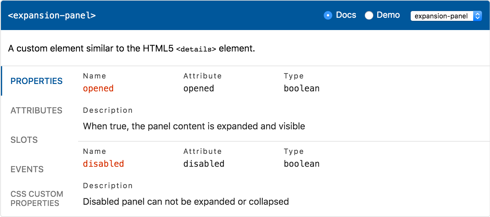
Change Log
All notable changes to this project will be documented in this file.
The format is based on Keep a Changelog
and this project adheres to Semantic Versioning.
[0.6.4] - 2021-12-08
Added
- Custom CSS properties for header and tab color
Fixed
- Adjust selected tab border radius
[0.6.3] - 2021-12-08
Fixed
- Remove leading slash to fix root path lookup
[0.6.2] - 2021-12-06
Fixed
- Apply Rocket patch only locally
[0.6.1] - 2021-12-06
Fixed
- Changed postinstall script to prepare
[0.6.0] - 2021-12-06
Breaking Changes
- Updated to use Custom Element Manifest JSON format
- Updated
marked dependency to 4.0.0
Added
- Added
docs-container and demo-container shadow parts
Fixed
- Docs: do now throw when panel does not exist
- Demo: reset selected tab when element changes
- Add missing
.js extensions to imports
[0.5.0] - 2021-11-01
Breaking Changes
- Upgraded the component to use Lit 2.0.0
- Updated
marked dependency to 3.0.0
Added
- Added
demo-snippet CSS shadow part for styling
[0.4.4] - 2020-03-27
Fixed
- Demo: fix logging custom events with empty detail
[0.4.3] - 2020-03-25
Fixed
- Demo: fix regex to not throw exception in Safari
[0.4.2] - 2020-03-11
Fixed
- Docs & demo: improve appearance on small screens
- Demo: fix regression with code snippet styles
[0.4.1] - 2020-03-10
Fixed
- Demo: handle native events without
detail properly
[0.4.0] - 2020-03-10
Added
- Two new elements:
<api-docs> and <api-demo>
- Public
elements property for passing data directly
- Public
exclude-knobs property for excluding knobs
- Public
setTemplates method for using custom templates
- New shadow part
header-title, placed inside header
- Docs: custom CSS properties type and default value
- Docs: add
part attribute to rendered markdown elements
- Demo:
prefix, suffix and wrapper templates
- Demo: custom attribute knobs (string, boolean, select)
Fixed
- Demo: fixed quotes in default value for string knobs
Changed
- Templates are now stored separately for each instance
- Demo: do not wrap default slot content with
<div>
- Demo: default slot knob value changed to "Content"
- Docs: removed
id from headers in rendered markdown
[0.3.13] - 2020-02-16
Fixed
- Demo: do not set value for readonly properties
[0.3.12] - 2020-02-06
Changed
- Docs: use white-space: pre-wrap for <pre>
- Demo: make sure demo output clips content
- Docs & demo: remove max-height from panels
[0.3.11] - 2020-02-04
Changed
- Demo: wait for LitElement / Stencil update
Fixed
- Demo: sync property knobs when true by default
[0.3.10] - 2020-02-04
Added
- Added
demo-parts CSS shadow part for styling
Fixed
- Docs: apply font styles to lists in markdown
[0.3.9] - 2020-02-04
Fixed
- Demo: fix handling dash-case attributes in knobs
- Demo: fix handling attributes in code snippet
[0.3.8] - 2020-02-03
Fixed
- Docs: match attribute with different name
- Demo: fix empty value for numeric knobs
- Demo: support attribute with different name
[0.3.7] - 2020-01-09
Fixed
- Demo: fix handling numeric property knobs
[0.3.6] - 2020-01-09
Fixed
- Demo: do not include getters to property knobs
- Demo: use
text-align: initial to not override
- Demo: add missing
input part for property knob
[0.3.5] - 2019-12-23
Fixed
- Docs: do not convert property type to lower case
- Demo: prevent unexpected slots knobs reordering
[0.3.4] - 2019-12-20
Fixed
- Demo: do not throw when property type is empty
[0.3.3] - 2019-12-19
Fixed
- Updated
highlight-ts to work with unpkg.com CDN
[0.3.2] - 2019-12-19
Fixed
- Reverted accidental lit-html and lit-element bump
[0.3.1] - 2019-12-19
Added
- Added
knobs CSS shadow part for theming
Fixed
- Fixed radio buttons scoping issue in Safari
Changed
- Replaced
illuminate-js with highlight-ts
- Refactored and simplified internal components
[0.3.0] - 2019-12-17
Added
- CSS shadow parts are now available for styling
- Docs: support default values for properties
- Demo: support
<template data-target="host">
- Added
--ave-tab-indicator-size custom property
Changed
- Updated
web-component-analyzer to 1.0.0
- Updated
marked to 0.8.0 with ES modules
- Replaced
prismjs with illuminate-js
- Simplified visual appearance of tabs
- Improved responsive layout in header
- Demo: added labels for knobs inputs
- Extracted
ApiViewerBase base class
Fixed
- Demo: fix handling types with null and undefined
[0.2.9] - 2019-12-02
Fixed
- Docs: fix knobs type detection to handle null
[0.2.8] - 2019-11-25
Added
- Docs: added custom CSS properties for link colors
Fixed
- Docs: improved the multi-line descriptions appearance
[0.2.7] - 2019-11-21
Fixed
- Demo: fixed font family and size in the code snippet
[0.2.6] - 2019-11-15
Added
- Exposed
selected property to toggle selected element name
[0.2.5] - 2019-11-13
Added
- Exposed
section property to toggle between docs and demo
[0.2.4] - 2019-11-11
Fixed
- Docs: tabs are no longer shown if there is no documented API
- Demo: knobs are now hidden if there is no properties / slots
Changed
- Demo: adjusted source code snippet vertical padding
[0.2.3] - 2019-11-06
Fixed
- Element selector is now hidden if there is only one element
[0.2.2] - 2019-11-05
Added
API docs viewer
- CSS Shadow Parts: name, description
[0.2.1] - 2019-11-02
Fixed
- Docs & demo: UI is no longer shown when JSON is empty
- Docs: elements with empty description are rendered correctly
- Docs: description for properties is not displayed when empty
[0.2.0] - 2019-10-30
Added
API docs viewer
- CSS custom properties: name, description
Live playground
- Source: code with syntax highlighting
- Knobs: edit properties of the component
- Knobs: edit slotted text for each
<slot>
- Knobs: sync on
[prop]-changed events
<template> for complex slotted content- Styles: editing CSS custom properties
- Events: logging events of the component
[0.1.0] - 2019-10-22
Added
API docs viewer
- Properties: name, type, attribute, description
- Attributes: name, type, description
- Slots: name (if any), description
- Events: name, description
